

Disclosure: Although Strata competes at some level with the tool reviewed here, our goal is to provide the least biased review possible. The point of this series is for us to understand the market offering better and bring you all along.
Getting Started
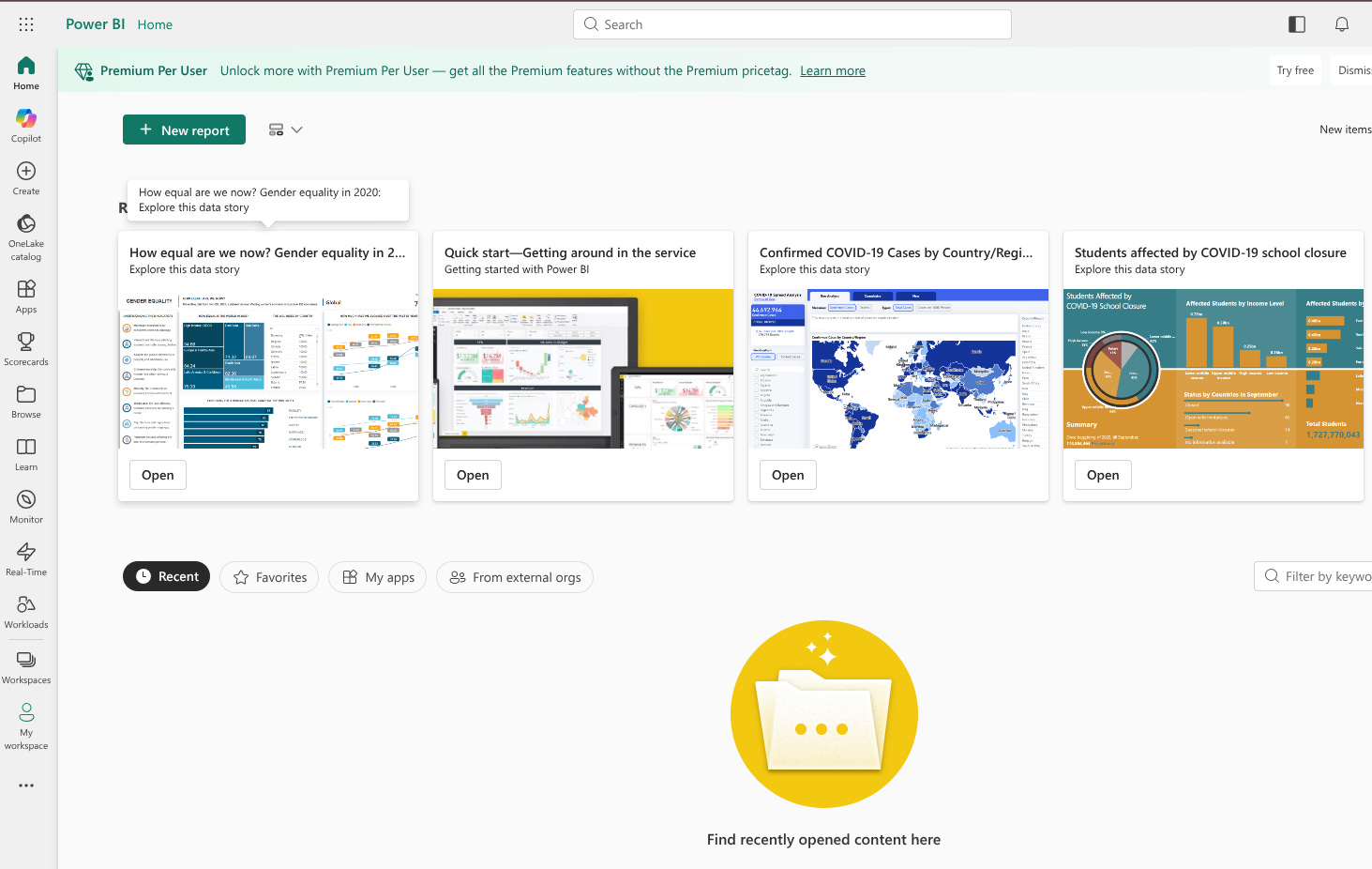
Super easy signup flow so long as you have a business email. Unlike Looker there is no gating for the free tier.
As soon as you login in you are greeted with lots of example dashboards and links to educational resources. Quite a nice intro rather than drop you straight into an empty canvas.
For this review we will stay in the free tier since that covers most of the important features we care about. The premium tier has the following extras according to their own Support agent:
Enhanced Enterprise BI and Collaboration
Performance and Capacity (Dedicated)
Advanced Features:
Access to AI capabilities and advanced dataflows
Paginated reports and other advanced reporting features.
The first step here is to create a report. That is the prominent action the UI is driving you toward. On the next screen you can connect your data sources. The amount of connectors offered here is insanely broad. Everything from simple CSV to Zoho Creator. Impressive but right away we can see that a technical user is meant to be in the driver seat here.
Review Setup
We are testing Power BI and other BI tools against our AWS Athena data warehouse. Its loaded with a small sample size TPC-DS data model. Our objective with this review and other BI tool reviews is to see how much self service can you enable for non technical users. How many personas are involved in maintaining this tool in a well functioning analytics deployment?
For AWS Athena you have to setup a data gateway. This means running an ec2 instance in your vpc that connects to Power BI and can issue queries against Athena. Surprisingly, you don’t have to do that with Redshift.
We ended up opting to download the desktop app to build our models. Data gateway seemed like a huge time sync. In retrospect, it probably was faster than dealing with Windows, ODBC driver issues, and locally installing Power BI.
Semantic Layer
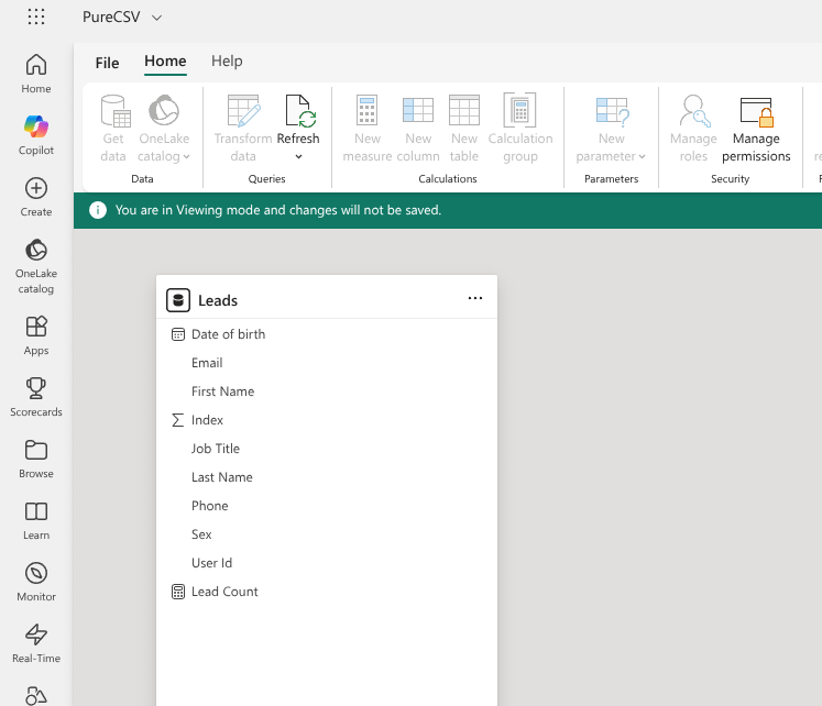
Interestingly, even using a CSV file as a data source leads to the creation of a semantic model. If we understood everything correctly, you connect data (apply transformations if needed), create a semantic model, then build your report on top of said model. This is regardless of the source. This is actually quite impressive considering the breadth of sources supported out of the box.
The comprehensive coverage of data sources and the general design of Power BI likely will lead to the proliferation of semantic models. Even a small company might have dozens or more for different needs. There will be great temptation to let the semantic models stand in for an enterprise data warehouse program. This could work so long as the volume and breadth of data is light. It would take great discipline to ensure that only a few models existed. Even when there is an enterprise data warehouse program it would be quite expedient to create a semantic model for different use cases rather push general solutions to the warehouse.
We believe in spirit the semantic model is meant to be used atomically rather than as a generalized model here. While more capable than Looker Explores and Tableau Data sources it is very similar in nature. You setup a unit of a analytics primitives that you can derive visualizations from. These base units can be shared sources of truth but duplicates are likely to proliferate. This is quite different from tools like MicroStrategy, Business Objects, and other legacy BI tools. It’s also different from broad middleware semantic layers like MetricFlow and Cube. Strata on the other hand is modern update to the concept of a broad semantic layer that marries both tiers. All of them have their own pros and cons.
Now onto important semantic capabilities. Power BI models can be built with Import, DirectQuery, or Composite mode. More on this in the performance section. And versioning is built in and not integrated into Git or other version control systems.
Cross Domain Data Blending
You can have many fact tables in the same model with conformed dimension enabling some level of automatic blending across fact tables. However, the semantic model assumes all the dimensions in the model are legal. For example, if you had Store Sales fact and Web Sales fact in the same model. Now let’s say all the dimension tables are related except for the Store dimension table. This can only be joined to Store Sales. However, when you create a report it will allow you to combine Web Sales with Store Name. Meaning, the user of this model needs complete awareness of the data model and what legal constructs are.
The semantic model here is meant to be designed by highly technical users and its meant to be used by technical users. More on personas in the Primary Operator section.
Measures
Once you become an expert on DAX (Data Analysis Expression) language there are probably no limits to the type of measures you can create. In fact, DAX enables an easy but expensive out: custom calculated tables via DAX expressions. The biggest drawbacks are the learning curve and balancing performance. As you add more derived tables and measures performance degrades.
While expressive, DAX doesn’t quite tie one to one with SQL. Here is an example of how you could create a semi additive measure:
Closing Balance :=
CALCULATE (
    SUM ( Inventory[UnitsBalance] ),
    ENDOFMONTH ( 'Date'[Date] )
)
CALCULATE (
Semantic Layer Summary
We watched an excellent tutorial on building data models for Power BI. The tutorial covered some advanced use cases involving “ETL” as you develop your semantic model. ETL is done completely in the Power BI desktop app with an Excel like experience. It slots right into the flow of building out the semantic model. The programming interface is DAX when you need it. In some ways this is amazing if you are afraid of coding, but it’s quite a departure from typical Enterprise scale data engineering. Honestly think learning python and basic data engineering would actually be easier in the long run. Complex GUI’s have buttons and menus all over the place. And they follow rigid paradigms. If you can learn that, you can probably learn python which is more expressive for your goals.
In summary, the Power BI semantic model with its integrated ETL paradigm may work well for small and mid size businesses. Once you get to dozens of fact tables or even a single fact table at terabyte scale, this is unlikely to work well. It’s great for technical minded users that are weary of programming, but even still they will ultimately have to learn the DAX language to be effective.
Building Dashboards
Reports allow you to build a series of pages with interactivity in a defined boundary. From the report you can pin each page to specific dashboard. They then arrive in the dashboard as a tile. Dashboards are just a series a pinned tiles from various reports.
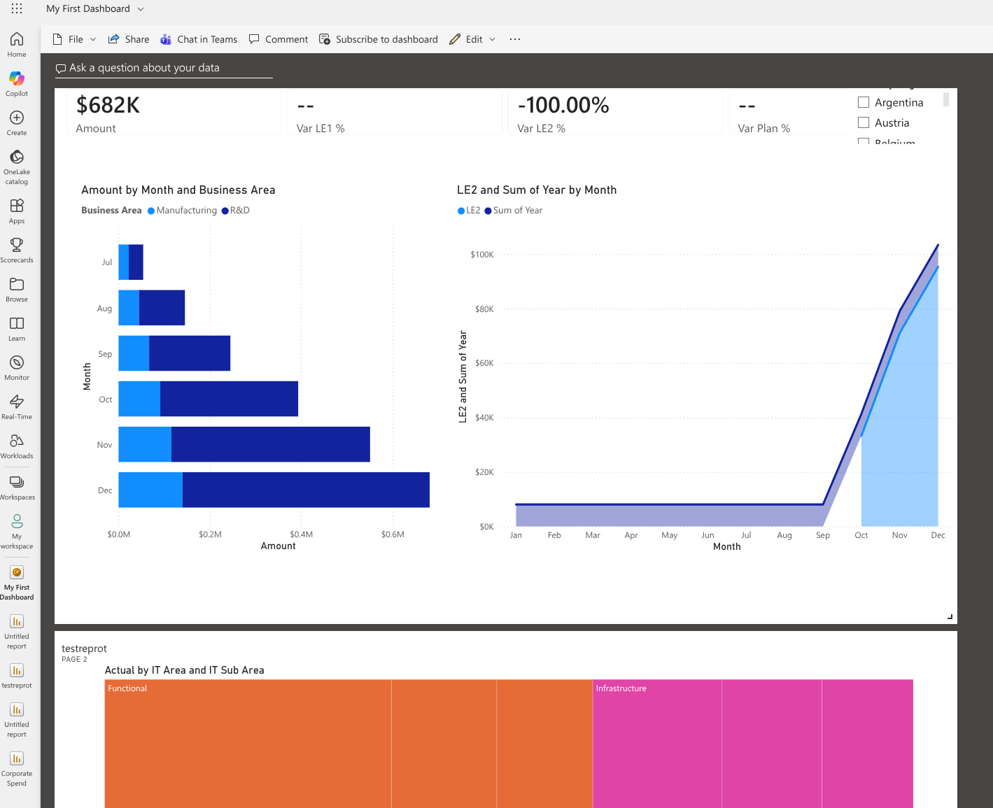
You build reports by getting data, creating a semantic model for the data, and using the model to create visualizations in different pages. Again this is for any data source even csv files. The visualization build is the common style. Drop zones and checkbox fields to promote semantic entities into the viz. If your semantic model can support import mode, this is quite snappy.
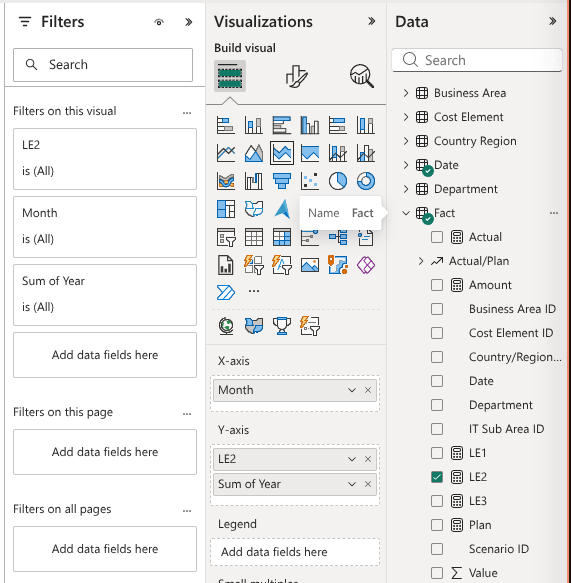
All of the common visualization types are covered plus several extras (decomposition tree, funnel, matrix etc). It also sets up the interactive components as a “visualization”. These are called “slicers”. Placement of visualizations and slicers are pixel perfect within the page boundary. You can place anything anywhere. The page boundary can be set to Fit to Width (full width) for a responsive layout. We could not get the dashboard to be full width though. You can create very pretty dashboards as easily as you can create ugly dashboards. Padding, alignment, and colors are up to the author.
When defining a visualization, especially complex ones, there will be specific drop zones/cards dedicated to each component. For example, a bar chart with trending line will have a specific drop zone for Y axis line. Which is different from the Y axis for the bars. This is easier to us than Tableau where everything is rows, columns, sometimes measures, color by etc. On the other hand it would probably limit the range of visualizations since each one would need a corresponding config.
Power BI has a cool feature that can auto create a report for you. This will land a beautiful layout with key metrics highlighted. The only problem with this is when you you have fact tables with 30+ metrics. Then it’s an unfocused series of visualizations you have to manually delete.
Generally, building reports and dashboards are easy if you understand the semantic model. You must know what combination of measures and dimensions are legal. This is a limiting factor on who can author a report even for technical users.
Performance
There are three primary ways to manage performance. Those are DirectQuery, Import, and Composite mode set on the semantic model. This is done when you create the model. You can guess that import mode would be the fastest. It loads the entire model into proprietary columnar format. DirectQuery is like Tableau’s live connection. Here queries are live against target data source. Finally, composite mode allows you import some portion of a table with incremental refresh. Queries will hit the in memory dataset when possible but push down into the warehouse for out of partition data.
We only tested import mode on a small dataset. It was responsive and snappy in both create mode and consumer mode (dashboard user). One caveat is that some transformations and measure functionality are limited in DirectQuery mode. Basically, anything that can’t be converted to a single query would likely not work.
AI Integration
We did not test this as it requires a paid upgrade. Additionally, they did not have a bring your own AI subscription option as far as we could see.
Primary Operator
Most Enterprise productivity software have many personas involved. Some are active while others are passive. This is especially true of Business Intelligence applications. Some users create content and while others simply consume content. The Primary Operator is the active user meant to use the full functionality of the product. They are the users mainly benefiting from a productivity boost. Another way to think about the primary operator is that absent this tool they would still have to complete the task somehow.
Given the definition above we can safely say the primary operator of Power BI is someone deeply technical. While you don’t have to be a coder, you have to be an expert on Power BI, understand data models, some knowledge of SQL, and will likely need to learn the DAX language.
In the case of non technical users, they can easily consume existing Power BI dashboards. The extent of customization will be limited to the the slicers enabled in the dash. To get more hands on, the non-technical user will first need to resolve which semantic model has the data they are looking for. They would need to know what dimensions and measures can be combined safely. And finally learn how to navigate the extremely powerful yet complex UI.
Summary
Power BI truly lives up to its name. It’s a powerful tool that gives a technical person high leverage over end to end dashboard development. From a broad range of data sources and integrated data transformations to semantic modeling and report building. The breadth of its capabilities are impressive. There is a likely a button, amongst the hundreds of buttons, for anything you need.
The choice of Power BI comes down to who you are trying to enable. Do you have a community of users who are deeply technical but can’t/won’t write code? Or, are you trying to enable non-technical users. If the former and you are already a Microsoft shop, Power BI is a no brainer. However, if you are trying to scale self service to a wider org of less technical users you will need something else. Maybe in addition to Power BI.